Orinda Heights Logo Design
A Jewel in the Crown
Orinda Heights is a community in Orinda, California, and home to many affluent suburban professionals who commute to cities in the Bay Area such as Oakland, San Francisco, and Walnut Creek. Its location in the rolling hills of a Chaparral biome makes for a warm and sunny microclimate and a pastoral landscape. Orinda's many parks and trails make it a destination for many Bay Area nature lovers.
Award-winning homebuilder Shea Homes is a family-founded business with a rich history that includes a role in building the Hoover Dam and Golden Gate Bridge. They are known for their careful selection of materials, attention to detail, and empathic approach.
Shea Homes builds residences that are relatively attainable, but Orinda Heights is a new level of luxury. The objective was to create a logo that would have a strong sense of status while feeling that it was still part of the landscape of quiet Orinda.
Process
For this project, I was given the general context of Orinda’s exclusive reputation and natural beauty. The builder wanted to stress the aspect of luxury without alienating its neighbors. It was hinted that I should think about fashion labels.
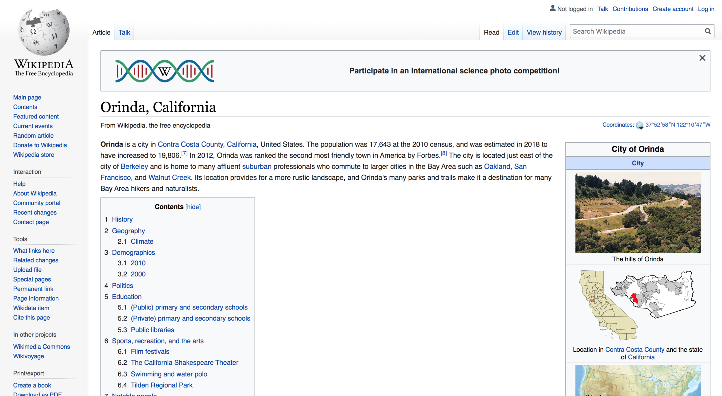
I began with a “knowledge swarm.” As a Wikipedia lover (and supporter), I went there first and read about the location. That lead me to a few articles about Mount Diablo and the Chaparral environment. From there, I started to gather a variety of photographs to meditate on colors and atmosphere. Remembering that a luxe lifestyle would also be implied, I looked at the identities of three of the most heritage, luxury fashion labels likely familiar to potential buyers. Orinda Heights would be like a Hermes Birkin Bag, not a Gucci Baby Backpack. From there I started sketching digitally in Illustrator, to come up with 4-6 varying ideas that could be developed.
The Hermes orange recalled California Poppy orange, which I had seen growing wild on the hillsides of Orinda. Colors and illustrations started to come together with the various typefaces that had struck a chord with me when I typed out Orinda Heights. After two rounds of internal review, we were able to put together a nice deck and presentation boards for Shea Homes to look at. The marketing team quickly came back with a resounding vote for the “growing poppies” logo, which had inspired the team to integrate the California Poppy beyond the brand and into the landscape design of the future neighborhood.
To me, the logo captures the natural beauty of hilly Orinda with the delicate poppy. The decision to render the flower in its natural colors and not in an allover statement orange keeps the imagery soft and friendly. And the typeface Bodoni is just plain beautiful. The aristocratic Giambattista Bodoni’s elegant proportions elevate the name, while Avenir offers a down-to-earth reminder that this aspirational community is brought to you by Shea Homes.


