
Manzanita Park Logo Design

Client
Manzanita Park is in Morgan Hill, California on the valley floor of the Santa Cruz Mountains and less than a half-hour away from San Jose. It’s a small city attracting Silicon Valley professionals who want to live close to work, in a more beautified setting that is a still touch urban.
Dividend Homes, a high-end boutique homebuilder, has a history of creating Spanish-inspired communities that harken back to romantic Spanish California, as well as the idealized Mediterranean life. I wasn’t given much information at the start of the project. I was told the client had chosen the name, and they were eager to see some aspect of the Manzanita tree, particularly the notable red bark.
As a well-traveled Colombian-American, I have a fondness for Spanish and Latin tropes, so after doing my initial dive to learn all about Manzanita Trees and collecting a cache of Manzanita related images, I launched into an exploration of ceramic tiles, chaparral inspired color palettes, the vintage signs of Spain, art-nouveau product packaging, etc.. I was very excited. I also knew that I wanted to imbue the designs with a contemporary, graceful aesthetic, while capturing some of the craftsmanship of Latin culture.
To do that, I looked to the typefaces of Latino designers. I looked for typefaces with an overt handmade quirk. I tried manipulating type into something reminiscent of the wrought-iron gates and signs of Barcelona. Where for some projects I might jump right into vector illustration after some initial thumbnail sketches, for this I started by free-hand drawing and then hand tracing and compositing elements of the Manzanita tree to create original illustrations.
Branching Out
Currently, Dividend Homes is moving forward with the four tile design with the Manzanita branch. I am thrilled by their choice because there is so much to draw on in this logo. It exhibits the colors of a chaparral-inspired landscape, which can now be used to color-code aspects of the community. It has a tile-like appearance that recalls the Hispano-Moresque ceramic industry, which conjures open-air courtyards and warm sunny days. I’m proud to say that it includes my own hand-drawn and then vector rendered illustrations.
My Type of Guy
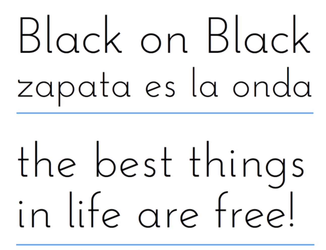
Lastly, the type nerd in me is so into Josefin Sans by Santiago Orozco of Monterey, Mexico. The idea of this typeface is to be geometric, elegant, with a vintage feeling, for use at larger sizes. It is inspired by geometric sans serif designs from the 1920s. It also features an unusual x-height, which is halfway from baseline to cap-height. Also! Several of its letters have offshoots that jut out above the cap height, lending the design a more hand-lettered appearance. I really dig that modern “Zorro-esque” “Z.”